Tuesday 25 September 2012

Illustration Article

Using the college library i researched the different types of illustration magazines/journals/newspapers, these are:-


  1. Illustration Magazine
  2. Creative Review
  3. The View Newspaper

One article that i particularly liked was from Illustration magazine Summer 2012's issue:


I particularly like this article because of the storyboard quality that lets you look at the design process behind this particular illustrator's work. I also like the fact that the illustrator (Korky Paul) is more of a non computer based illustrator, who uses splashes of colour and watercolour and ink together to create quite a unique style.

Week 3.... Illustration (Matthew Richardson)


One of the purposes of Richardson's illustrations is for book covers, like the one above. I particularly like this piece because of his use of photography, which has been worked over with different textures and blended together in a green hue. I also like the fact he has placed quite sketch and bold illustrations over the top of the photograph. In my opinion this creates a very stylised and original effect.

Richardson's work here is definately for the more adult/mature audience. I like the fact that his work is quite abstract, yet also simple and quite thought-provoking. Finally i find it interesting that one main background colour has been used, i think this creates quite a calming mood for the piece.


Sunday 23 September 2012

Graphic Design Final Outcomes and Reflection

After a week of research, planning and creating i managed to create four final outcomes:


Cascade

The purpose of this piece was to be calm and 'flow', however, i think that i relied too heavily on image. In my opinion the overall piece was too literal, i think i spent too little time on this pice and the colour of the writing is too harsh. Another reason i do not like the piece is that the Typography is extremely pixelated and it does not fit well with the rest of the image.

 
Fuse
 
The purpose of this piece was to show the boldness and the electric side to the word. I think i accomplished that quite well and i didnt brely too much on image, only scanning in collages and sketches that i created myself.
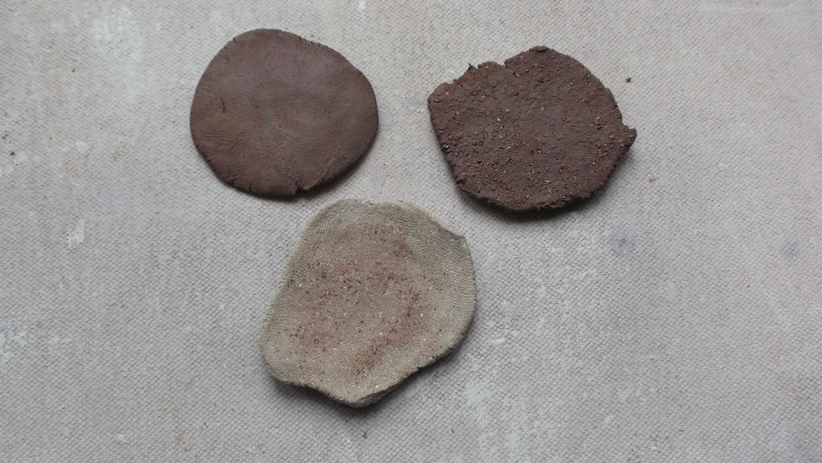
 
 
Migrate
 
The purpode of this piece is to bring forth the travelling and leaving behind side of the word, shown by use of the pebbles and feather. I think that even though i relied heavily on imagery to get the poin across i still like this piece because of its simplicity and aesthetically pleasing qualities.
 
 
Rattle
 
The purpose of this piece was to show the literal sence of the word without being too literal. I like the end product of this piece because of the overall flowing nature of the image and the way it fits on the page. This image was simply a scanned in copy of a exploratory collage done in my sketchbook with typography added. The only aesthetic shortcoming i can find with this piece is that the typography could use  little more tweaking to perfect the overall image.


Reflection on Week 2:
 
 
After this past week of introduction to graphic design i often find myself stopping to look at pagackaging in the kitchen or a bottle of shampoo in the bathroom, and appreciating the work that went into the graphic design aspect of that partcular product. I think that from now on i will be more aware and make a concious effort to appreciate graphic design is every day life more.
 
I find that i have been greatly inspired over the past week by most of the work and some of the artists i have looked into and been introduced to. Perhaps i will be able to transferr this inspiration into my own artwork in the near future.
 
The one main discipline i have found most interesting over the las week is Typography. This is because of the wide variety and compatibitlity in which typography is used. You often see it every day and it can effect your moods and intentions simply through visualisation.
 
I think there is a possibilty that i could be swayed in the direction of graphic design as a specialist subject, however, i feel that it is considerably too early to tell for definate.

Six More Graphic Designers... The library.

Using the college library I researched a range of graphic design books. However the two that I looked at more closely to find six more graphic designers that appealed to me were:

  • Women of Design
  • Graphic Design for the 21st Century

Here is my reflection on the designers that I found:


David Foldvari


Foldvari's work is much more graffiti based with most of his work containing only two colours (black and white), the reason that his work appeals to me so much is because, like his work above, he uses striking and often controvercial imagery with accents of colour to make hi images come alive.


Francois Chalet


Chalet's work is highly computer, animation based with characters that express emotion through actions. His work appeals to me beacuse of the way he uses colour to interpret emotions, like in the cartoon image of his above, the message of the image is not straightforward or apparent leaving the onlooker puzzling over what is happening. This way you can come to your own conclusion about the work itself.


Buro Fur Form


Form's work tends to use very bright and contrasting 'blocks' of colour to create images that often contrast with the slim, sleek text as on display above... The main reason that i was drawn to Buro Fur Form's work was because of the stark and bright colours and the flow of the overall piece.


Phillippe Apeloig

Apeloig's work is mainly in the Typography area of Graphic Design, I was drawn to his work mainly because of the unusual style and boldness of the colours used to accent the background of his work, (as displayed above).


Peter Anderson


Anderson is another Typography based graphic designer. The majority of his work is done using one accent colour, like the piece above. I was drawn to his work because of the unususal style in which he lins text and image together to create something that is not only aetheticlly pleasing but also leaves the viewer puzzling about the well obscured meaning to the piece.


Paul Smith


Smith's work is quite art deco and retro, he is most famous for his line pieces (above). The reason i was drawn to him in particular was that although his work could be described as boring, there is a aura about hi work. Also i like the way he uses colour to create a flowing and striking piece of art.

Wednesday 19 September 2012

Six Graphic Designers

Stefan Sagmeister (below left) & Alan Fletcher (below right) Comparison

Stefan Sagmeister's 'Fresh Dialogue' in my opinion, is extremely eyecatching and has an aspect of the WOW factor, primarily because of its black and white background with a starkly contrasting full colour tongue. In comparison to this I believe that Alan Fletcher's 'Beware Wet Paint' is still quite eyecatching with the use of bright very contarasting colours, however, I do not think it is quite as striking as Sagmeister's 'Fresh Dialogue' because although both are cleaverly thought out, only Sagmeister's creates more of a striking and thought provoking atmosphere.   
 
 
Pep Carrio (below left) & Noma Bar (below right) Comparison


In my opinion I like Pep Carrio's 'Cafe Mimosa' as it is quite a calming and tranquil piece, mainly because of the colours used like browns and creams, which are generally quite calming and peaceful. However, this piece could also be seen as quite shocking and contrivercial because of the nature of the photograph, (a woman breastfeeding her baby). In comparison to this Noma Bar's 'Bittersweet' is quite aesthetically pleasing and also shocking, because of its stark contrast and bright colours. I also like the fact that this piece has been well thought out and is also very thought provoking and unusual, because of the way the zip is interwoven with the mouth.
 
  
 Wim Crouwell (below left) & Kris Sowersby (below right) Comparison


I particularly like Wim Crouwell's 'Badges' Because he has used bright, and in some cases, contrasting colours to give quite a retro and srtiking effect. Kris Sowersby's 'Pretty Girl Hand Grenade' could also be seen as striking, however, for different reasons. Such as the way that the letters flow in contrast with the big, bold border on the piece. I also like the fact that the phrase he has used is verry apropriet for the contrast within the piece itself.  

Design Museum in London (Design of the Year 2012 Award)

The design museum london is a verry well known and infamous part of the design world, housing work by designers such as Christian Louboutin and Manolo Blahnik...

Design Awards of the Year 2012

"The Design Museum’s Design Awards, ‘the Oscars of the design world’, showcase the most innovative and progressive designs from around the world, spanning seven categories: Architecture, Digital, Fashion, Furniture, Graphics, Product and Transport. Visit the exhibition and explore the best design ideas from around the world"
              Extract from Design Museum London's Website.

Graphics Award
Nokia Pure
Dalton Maag

Dalton Maag

Maag is a graphic designer who won the design of the year award for his typography based work:

 
I particularly like his work because of the creatveness and obsurity of the design.

Week 2... Graphic Design

There are three major graphic design magazines/journals I have researched for my project,
  1. Creative Review
  2. Eye Magazine
  3. Computer Arts
In the library i browsed through examples of all three, but i found one article i like imparticular from Computer Arts Magazine:

computerarts.co.uk article

This article interested me because of the simple yet eyecatching colour palate and complexity of the design without creating chaos that the artist Junichi Tsuneoka has incorporated into this piece. Also the fact that it is a tutorial is quite pleasing because it encourages you to learn and encorporate the techniques used into other aspects of your work.

Applied arts... (Ceramics)

On friday i was introduced to several different types of  clay:


These are white clay, earthenware and stoneware clay. They all must be fired at different temperatures according to their makeup. I looked at a hand building technique called pinching:

 
I made this pod by patting out a ball of clay and slowly pinching aroung the ball with my thumb and index finger to hollow out and stretch the clay into a pot like shape. I slightly dislike this outcome because it is quite primitive and dirty. Next i visited the library and found an interesting applie arts technique for vases called 'Jack in the Pulpet'...
 

I particularly like this method because of the unusual shape of the rim of the vase and thought i could use this in my work. I also looked into the work of John O'Brien...

http://johnobrienceramicartist.com/

I find his ceramic work very aesthetically pleasing because of his use of bright bold clours, but with subtle design work. I though i could use both of these examples as inspiration for my own design. I made some design sketches before creating a rough prototype of my final design...


I used smooth clay and the pinching method to create this prototype, i like this example because it is quite flowing an simplistic.


Thursday 13 September 2012

Week 1 Metalwork Project

This week i was asked to create a small metal work sculpture using a wooden block. The project brief was set around Ndidi Ekubia and Hiroshi Suzuki's metalwork sculptures. I decided to take a closer look at Ndidi Ekubia's work more closely for inspiration...


I liked the idea of creating small pieces of metal to encorporate in my sculpture by using a variety of different techniques on each piece.


I also like the way that Ekubia uses flowing lines and shapes in all of her sculptures, so i tried to encorporate this into my sculpture too. (above images from google.com).

Here are some progressive images of my sculpture...


I created this piece using tin plated steel, I acid etched the steel before colouring it by heating the exposed steel to create this lovely roinbow effect. I like this piece because it is colouful and it also includes the fluidity, which i intended to base my piece around.


Step by step i started to nail the pieces of metal together onto the block of wood, however, i found thad the aesthetic side if the block so far was not verry pleasing because i think i rushed into the processes and didn't put enough thought behind them.


I quite liked the above piece i created by melting holes in the brass because of its unpredictability and the melted clumps created quite an aesthetically pleasing effect in their own right.


Shown above are the images of the final piece, i believe that i rushed into this piece too quickly and therefore i found that i made silly mistakes that could have been avoided if i had taken more care. Although i do not like this piece because of its roughness and overall scruffy look, i like the final image i took because it shows the sculpture in a better light... (this is the only side i feel that "flows" adequately).